NOYACK
2026
Designing a financial dashboard for wealth management
Designing and building a financial dashboard that turns complex wealth data into a clear, intuitive experience.


Role
Product Engineer
Timeline
July 2025
Team
3 Designers
Platform
Web application
Millennials lack financial literacy
NOYACK wanted to introduce alternative investing to HENRYs (High Earners, Not Rich Yet)—young professionals with strong income but limited experience with alternative assets. The challenge was designing an experience that could educate users while gradually guiding them from learning about wealth-building to becoming active investors. Characteristics of this target group include:
• High disposable income sitting in cash or low-yield savings
• Strong interest in building long-term wealth
• Overwhelm around investment options
• A gap between consuming financial content and taking action
Defining the Information Arquitecture
I structured the user experience around two clear user intentions: Learn and Invest. Instead of pushing users directly into a financial product, the website first met users at the point of curiosity. “Learn” helped users understand wealth-building concepts and alternative investing in simpler terms, while “Invest” created a more direct path for users who were ready to explore opportunities.

Benchmarking Investing Platforms
I analyzed how existing platforms structure their experience, grouping them into two distinct approaches: generalized investing platforms and specialized investment platforms. Products like SoFi and Stash focused on accessibility, bundling investing into a larger financial ecosystem. On the other end, platforms like Range and Carry were more focused and intentional, but assumed users already understood what they were doing.

Defining the Product Experience
• Establish Learn and Invest as distinct product experiences.
• Use the website as the acquisition/conversion layer
• Create gated financial resources to drive engagement and value
• Introduced tiered access based on investment commitment
• Make investor education a core product experience
• Integrate the investment infrastructure into the product experience
Color Palette
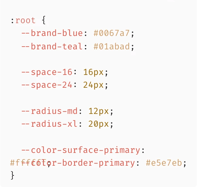
The color system follows established Material Design nomenclature and principles to create a clear and consistent visual hierarchy. Color pairings are selected with accessibility, contrast, and legibility in mind, ensuring each color serves a defined purpose across the interface.

Website Redesign
Our stakeholders wanted to lead the re-design with an agentic AI assistant designed to guide users through financial concepts. While useful, this created a positioning issue, since I found users began to perceive NOYACK as an AI company rather than an investing platform. I pushed back on this decision since the agent worked better as a service within the experience, not the main entry point.

Components
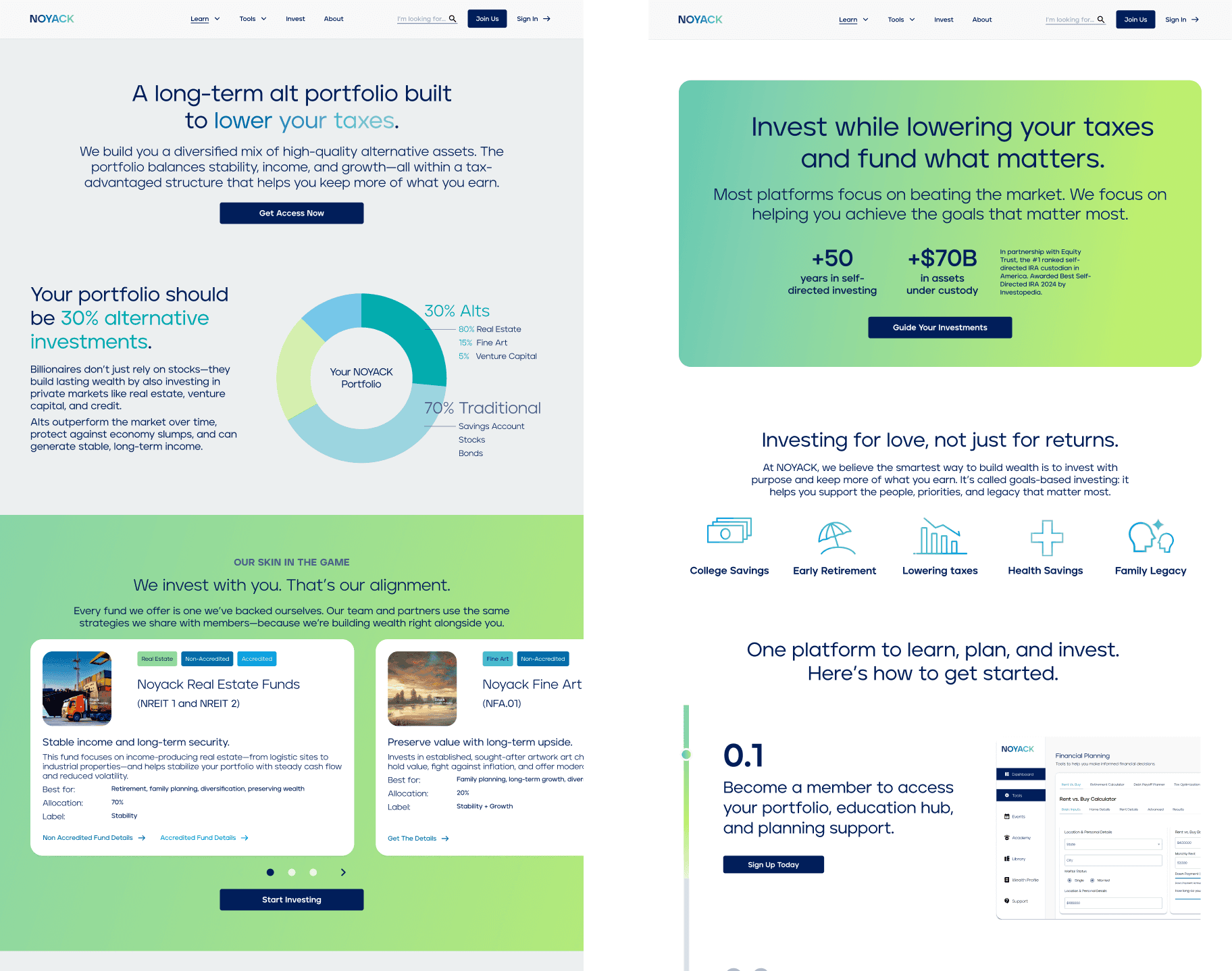
I built this component system to create consistency across the NOYACK experience. From fund and content cards to navigation, forms, and interactive elements, each component was designed with flexible variants and states to support different content and use cases.

From Education to Action
I translated the Learn and Invest structure into pages within the website that guided users from education into action. Learn introduced financial concepts and tools, while the invest pages shifted toward conversion, prompting users to create an account. This transition moved users into the dashboard, where they could begin engaging with alternative investments through a third-party integration.

Usability Testing (End-to-End)
I tested the full experience from the website through sign-up and into the dashboard. While users were able to navigate the flow, the testing revealed friction across onboarding, clarity, and positioning. Many users interpreted NOYACK as an AI product rather than an investing platform, which created confusion early on.
• Users wanted more proof of ROI before committing.
• Minimum Investment amount of 20k was too high for users to commit.
• The homepage needed a clearer value proposition.
• Users perceived NOYACK as an AI product not an investing platform.
“I wasn’t really sure what NOYACK was offering me. The messaging made it difficult to understand how it could actually help me invest.”

Paola S.
Interview Participant
Dashboard Experience
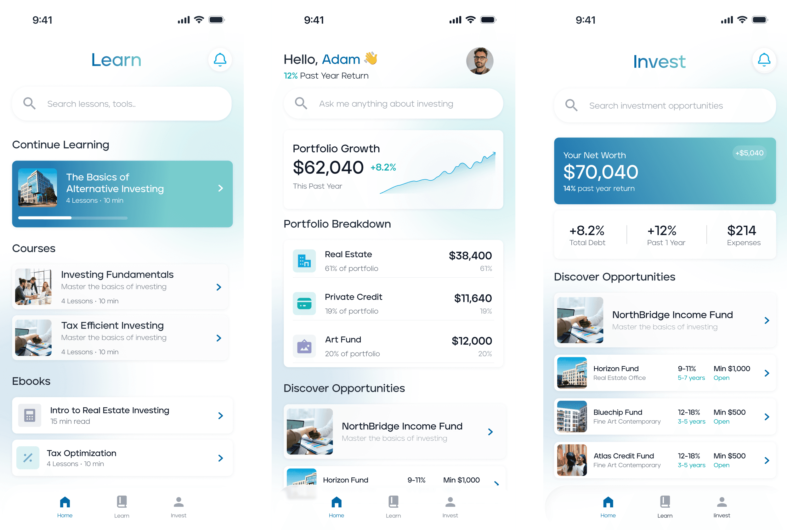
The dashboard encourages users to take a more active role in understanding their finances. Important information such as net worth and expenditure is clearly emphasized, enabling users to quickly assess their financial situation and learn about wealth management. Agentic AI agent was also implemented in every screen. After finishing the design I proceeded to build this application in React and Typescript.
Financial Calculation Logic
I implemented different financial calculators within the dashboard that were designed to dynamically update calculations based on user input, enabling real-time scenario modeling for retirement planning, debt payoff, and home ownership decisions.

Moreover, I created a scalable token system to standardize spacing, typography, color, and interaction states across the platform. This improved consistency, and simplified future feature expansion.
A Clear Path: Understand → Learn → Act
The experience was broken up into three parts so each screen has a job. Home is about quickly understanding where you stand. Learn shifts things into a more structured flow, so you’re not just given tools, but a way to actually build confidence. Invest is where that confidence turns into action.
Fundraising
We designed and tested a set of landing pages aimed at converting interest into investor commitment. By simplifying the narrative, clarifying the value proposition, and focusing the experience around a single call to action, the pages drove meaningful traction. Within two weeks, the campaign generated over $250K in funding, validating both the positioning and the overall direction of the product.

What were my results?
We were able to NOYACK into a one-stop financial hub, bringing together education, financial visibility, and investment access. Users can learn, track their finances, and take action—all within a single, connected experience. Below are some of our results.
$250k+
Raised in two weeks during
initial fundraising
60%
Increase in traffic during
campaign launch
35%
Increase in visitor-to-investor conversion post-redesign